Slight Site Modification
tl;dr - The site design is wider now.
I have a few articles written. As I was adding pictures to them, I realized that the small size of the pictures was losing the effect they were having on the article. Although I plan to redesign the site at some point in the future, I decided to expand the width of the site in the meantime so I wouldn't have to stop publishing.
The default monitor resolution at most companies according to my completely non-scientific poll is 1024x768. I've optimized the site to that. As a side note, I've found that most big-name companies design their web pages with the same resolution in mind. The article can now accommodate pictures that are 800 pixels wide rather than 300 pixels. This means that for the majority of the pictures on the site from this post forward, you won't have to click to zoom in and read the text.
For anyone with smaller monitors, the sidebar should be the only thing that isn't on the screen by default.
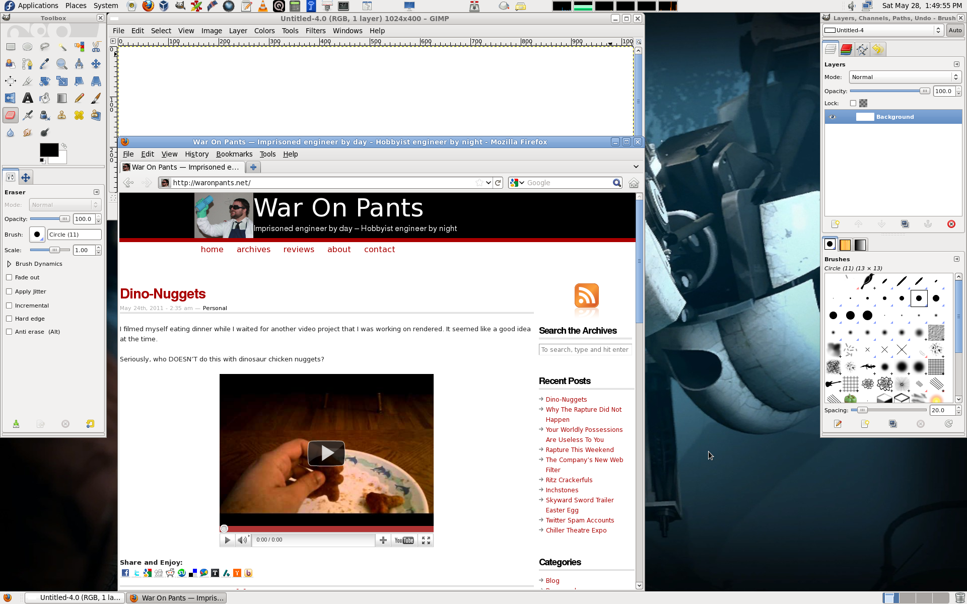
My monitor is 1920 pixels wide. How did I make sure that the design would fit on a 1024px monitor? I loaded up GIMP, created a 1024px wide image, and put my browser next to it.

I think this will improve the site's readability. Let me know what you think in the comments.
